Jukely — Discovery and Events
Jukely
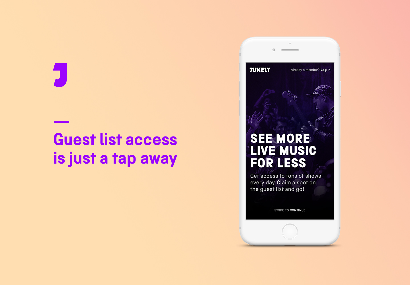
Jukely uses a subscription model to offer members the opportunity to see live music in 16 cities in the US, Canada, and Europe. Bypassing the fraught traditional ticket market, Jukely provides guest list access to popular shows without the hassle of purchasing advance tickets, and without costly extra fees.
I played a central role in developing the Jukely experience through strategic positioning and user personalization of the Jukely ecosystem. Harnessing a powerful combination of music discovery and curation to enhance each member’s live music experience, Jukely has synthesized the promotional needs of touring artists to connect fans with shows they’ll love.
Case Study: discovery and Access
Streamlining the app’s browse and show entry flow affords members clarity and ease of use from the point of claiming a spot to arrival at the venue. Members can easily reach out to friends to attend shows, add a +1 to their guest list spot, keep a record of their past shows, and see upcoming shows offered on the platform.
Show cards are what anchor the user experience in the app. The goal in this particular case study was to activate the show cards and offer insight about the venue, artist, and social activity of a given show. By giving more context to the user at the point of interest, the experience allowed for more organic discovery of events, especially with regard to emerging artists. Storyboarding and wireframing allowed us to discover key points of interaction and focus on particular screen flows.
WIREFRAME USER FLOW
Next steps included iterating on the wireframes to include the palette and build on the browse model and the show entry flow with the guest list spot claim modal, the upcoming show panel, and finally the show pass.


